for Kallos: on Friendship

I had so much fun creating this piece as an inside-page artwork for Kallos Magazine’s issue of friendship. They wanted an artwork that featured the quote, “He is your friend who pushes you nearer to God. – Abraham Kuyper”, and the illustration was drawn based off images of the members of this magazine. Below are the final product (in blue), and a few preliminary sketches.

Handlettering of Psalm 36:5-7

A custom hand lettered piece that really blessed my heart. ♡

As I wrote the words of this verse over and over again (because mistakes were made and the artwork had to be redone from start to finish, twice), I was reminded of how meditative lettering can be, and how the Word of God is so refreshing to the soul when we take time to slow down and eat of it. Though it was slightly frustrating when I spotted the errors after completing the work, it was also a much needed pause to take and rest in His word.

Here’s a real time video of the process, from layout to testing out strokes, to just having some fun before getting the actual artwork out. Thankful for the opportunity to bring this piece of God’s Word as a birthday gift.

for Little Eco Joys: brand/packaging design

Designed these florals for @littleecojoys (LEJ) packaging and branding cards.

I’ve always loved creating floral designs, so getting the chance to work on these brought much joy to my heart. LEJ wanted a simple and pretty floral design for their branding cards, and after multiple drafts, we agreed on the above.

If you’re all about sustainability or would like to get started, this is a brand worth checking out! They’ve stocked some really amazing items that I’ve enjoyed using, and would highly recommend.

for A For Apothecary: Totebag Design

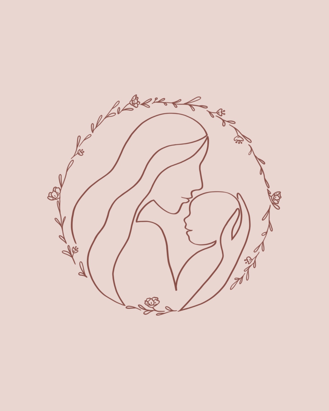
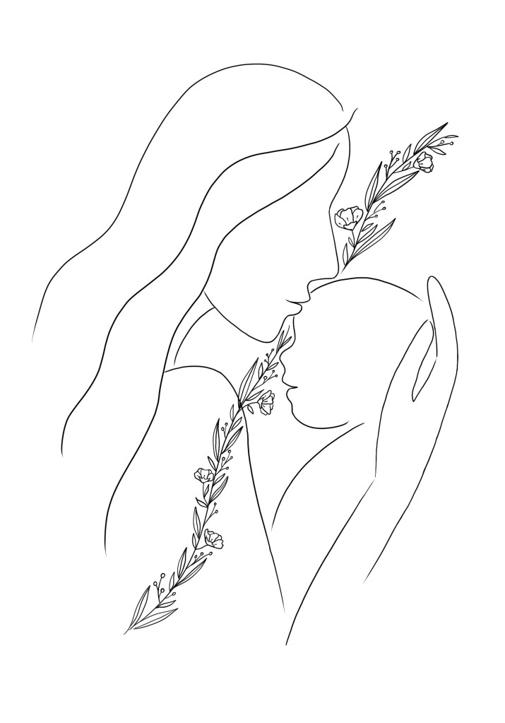
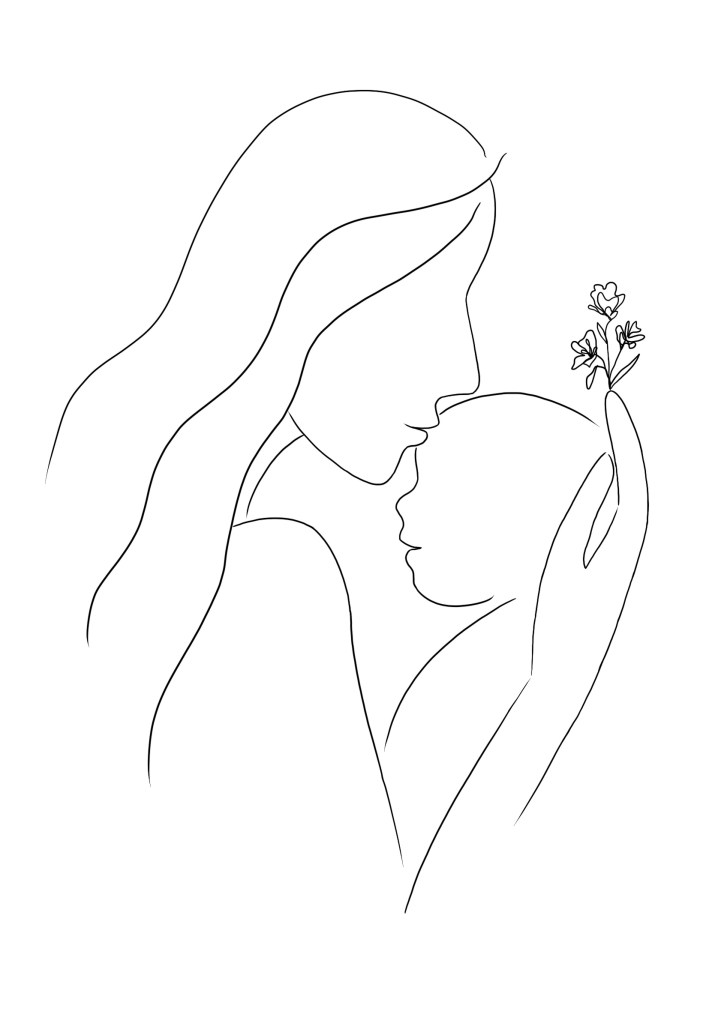
This collaborative artwork was done for A For Apothecary‘s 2021 totebag, and I truly enjoyed the design process for this project.

Behind the Design

From the values that A For Apothecary has at heart and after discussion with them, I felt that there were four elements that best represented the brand and were to be included in this illustration:

  • Mother + Baby (representing their target audience)
  • Hand (representing handcrafted products)
  • Floral/foliage (representing the natural ingredients used in its products)

The mother and baby were drawn with one continuous line to symbolise the beautiful, unwavering bond between mum and bub. While the floral was shaped into a wreath-like circle to bring a wholeness to its design.

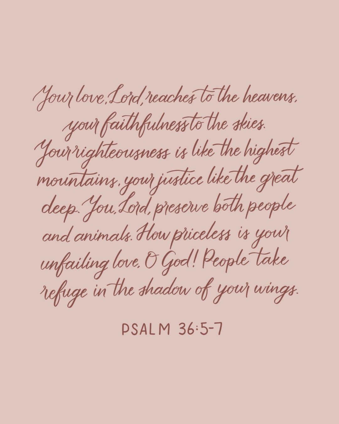
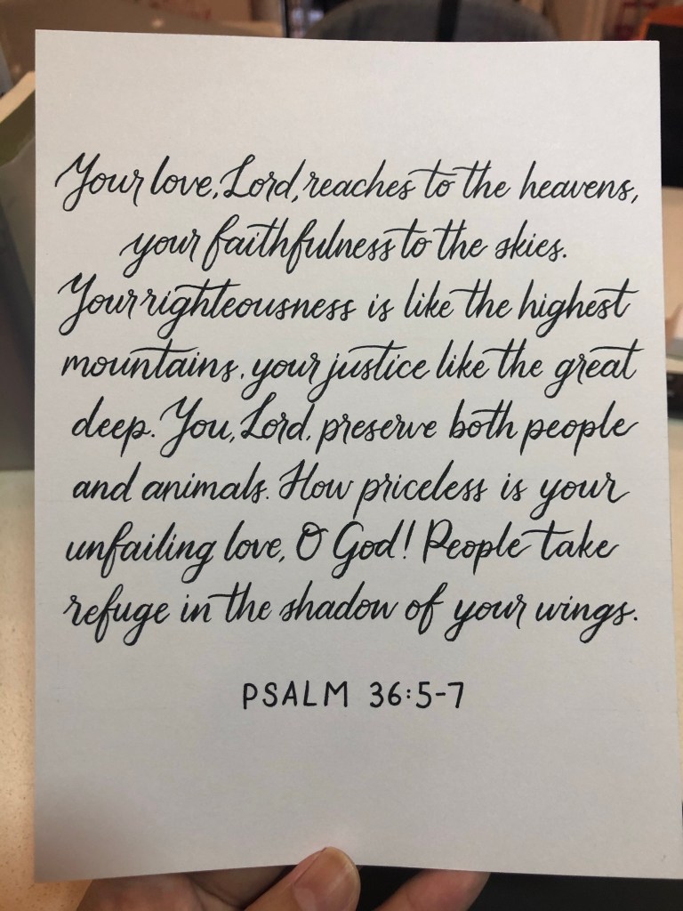
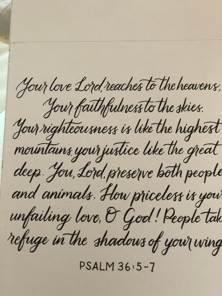
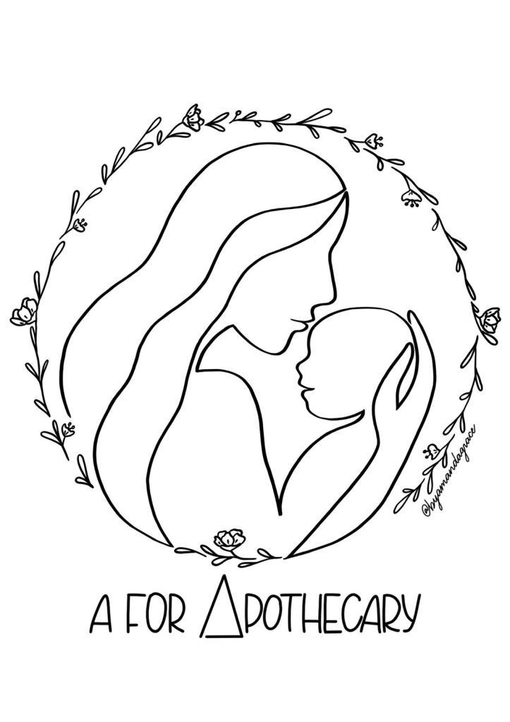
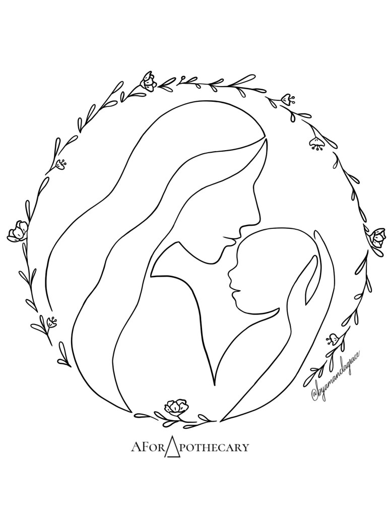
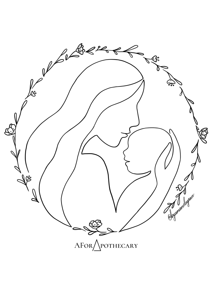
Below are final design, the actual print, and some of the initial sketches.