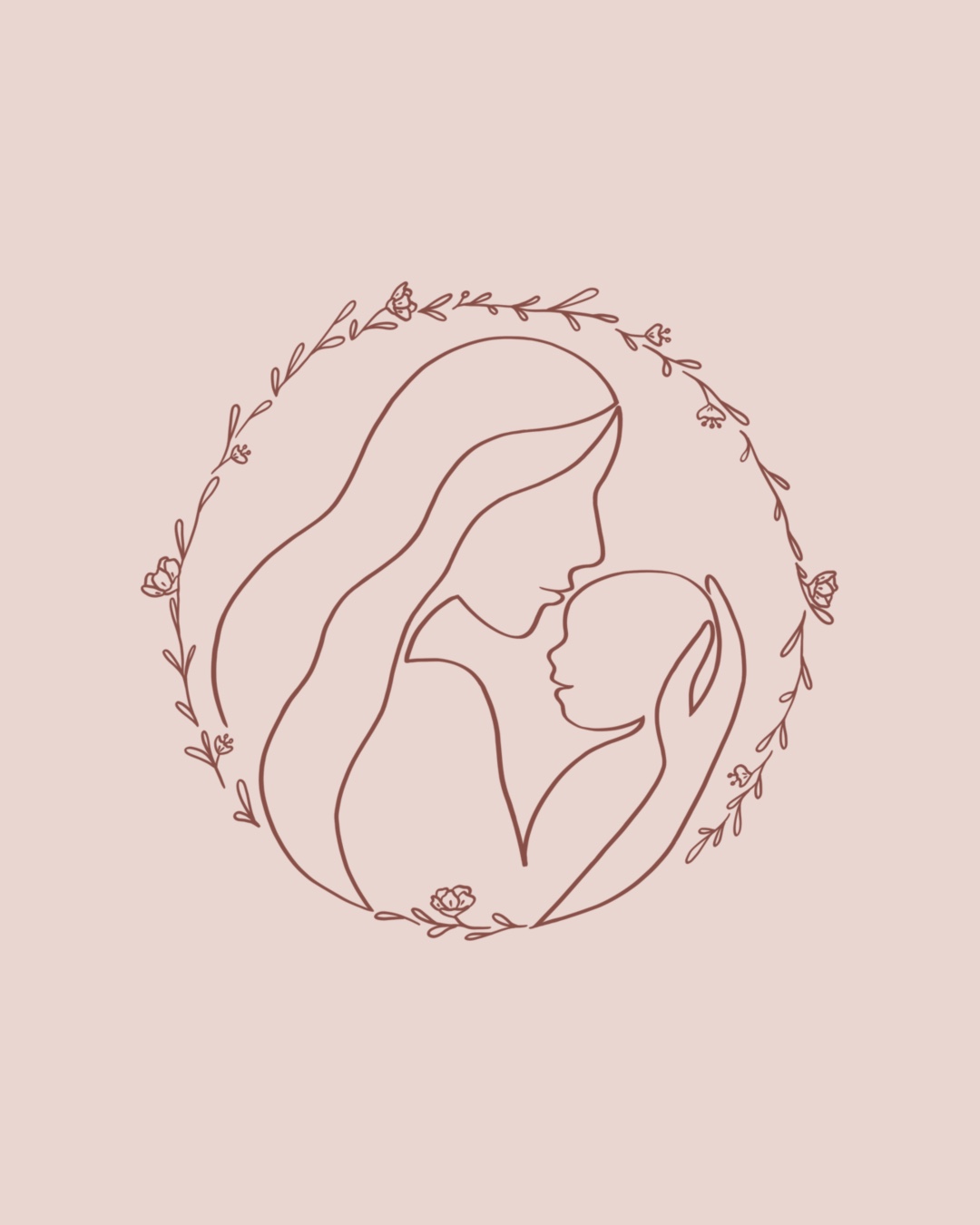
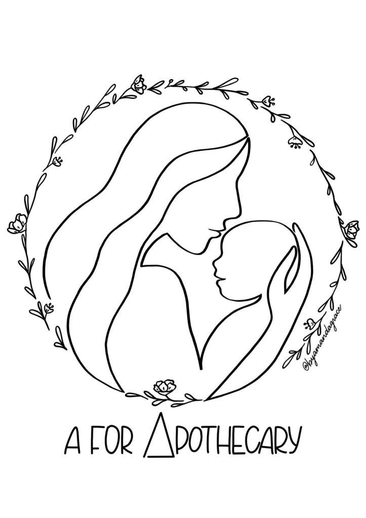
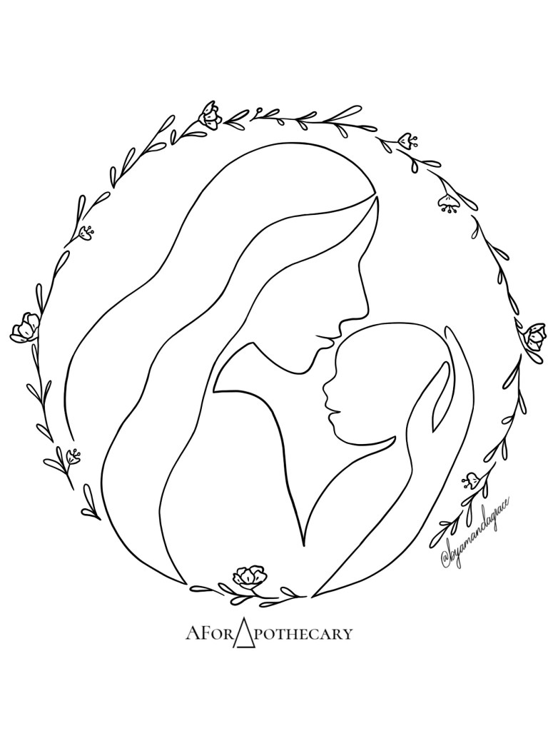
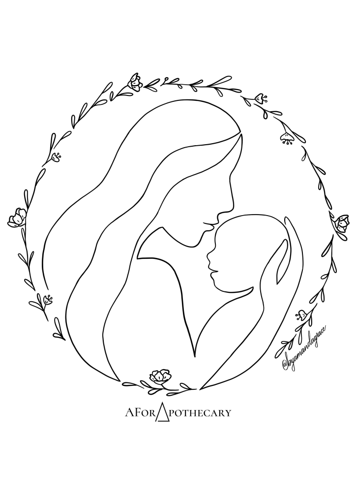
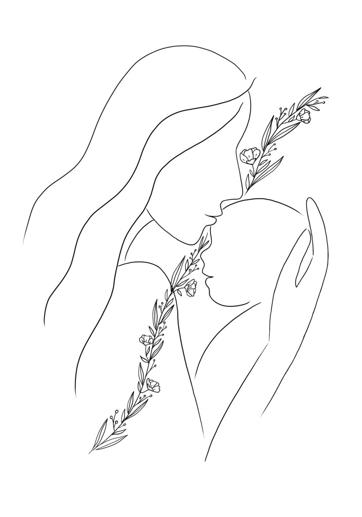
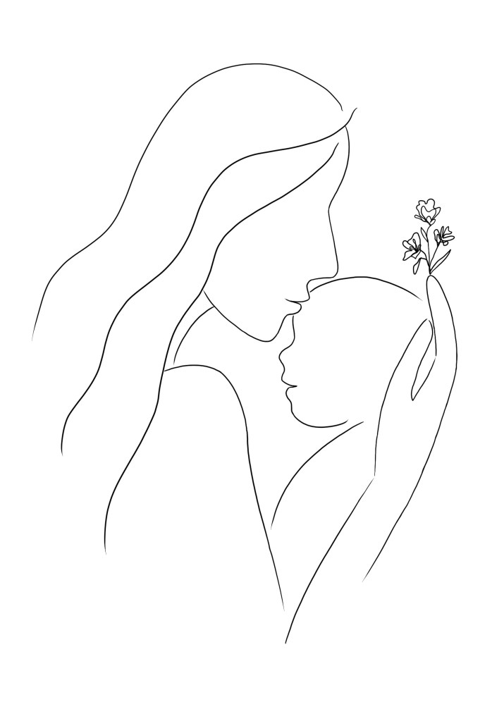
This collaborative artwork was done for A For Apothecary‘s 2021 totebag, and I truly enjoyed the design process for this project.
Behind the Design
From the values that A For Apothecary has at heart and after discussion with them, I felt that there were four elements that best represented the brand and were to be included in this illustration:
- Mother + Baby (representing their target audience)
- Hand (representing handcrafted products)
- Floral/foliage (representing the natural ingredients used in its products)
The mother and baby were drawn with one continuous line to symbolise the beautiful, unwavering bond between mum and bub. While the floral was shaped into a wreath-like circle to bring a wholeness to its design.
Below are final design, the actual print, and some of the initial sketches.
